Friday, 19 December 2014

Annotated Double Spreads


I will be annotating double sheet spreads. By doing this it will allow me to discover features used in a double spread which i then can use in my own double spread.

                        Annotating Double Spread Sheet 1


I annotated this double spread  to see which conventions a double spread uses. This double spread is from NME, I chose to annotate it as I have chosen to do NME for my magazine, Contents and Double spread.


The central image dominates a full page, it suggests it's importance. The biggest typography on that page is 'RADAR' which is in a masculine blue colour which links in with the boy band. It is aimed at both genders as the main heading states 'THE TEENAGERS', so the readers know what the article is on, however the background of the title is in blue, refers to males as an audience. After the title there is a stand first, overall their is a sky blue theme, the colour highlights the main area's of the spread such as the title and quotes.

The style of the magazine is very colourful and they use the same style of font over the spread but use the font in different sizes and use bold for main headings and important text, there is a drop capital- so 'T' is bold and in a capital which makes it stand out as it's a bigger size in font and it grabs the audience's attention to read along. Bold fonts suggests important information.

On the other page the text dominates with four of the smaller images, however the central image takes the attention of the audience  due to it's big size.

The image is very relaxing of 3 men relaxing and links in with 'The Teenagers' as there is a stereotype on some teenagers being lazy as they are always represented in the media in a negative way, they are shown to have murder, do drugs and steal.

In black there is a spiky circle that states 'NME loves', this will persuade the teenagers to read on as NME is a professional  company that 'Loves' them which suggests the magazine is recommending them to read.

The blue note puts further some features of the band, it states 'Need to know' which draws attention to the audience even though it is placed in the corner as it's in a bright masculine blue colour and the title 'RADAR' is in block capitals and is also in the top left corner, it's their to let the audience know what they're are reading.

The article on a whole seems to be very cramped between the central image and the text with the black background however is still read by teenagers who like to read. The colour white is used in the plain black text which contrasts between pure innocence and a sinister/ edgy colour - both the colours of white and black have many different connotations. The use of black as a background separates  it from the rest of the article, black and white help the article stand out from the bright blue.

The double spread follows the conventions of a normal spread where there is a big central image and the text goes on the right hand page, however the double page spread of Nicki Minaj is the opposite and doesn't follow the conventions of a spread as her image is on the right while The teenagers is on the left.

The image is off 3 stereotypical boys who are slouching on the bed and have women's photos behind them , the picture of the 3 boys could be aimed at one gender, which is males as they keep girl's photo.

Annotating Double Page Spread 2


The colour scheme of the magazine is mainly pink which suggests femininity, pink has connotations of being vulnerable as their is a stereotype of women being inferior to a man. The colour suggests the artist Nicki is completely feminine, the colour shows how young she is and how she appeals to a younger audience as girls like the stereotypical colour pinkthis . The black in her costume and the typography 'THE GOSPEL ACCORDING TO'  contradicts the pink as black is a edgy,dark colour, in Nicki Minaj is case the black suggests her fame and bling as she wears a big ring. Her make up is like a barbie doll and the colour of her lips tie in with the colour scheme of  pink.

Lightning is used on her face to achieve her glamorous model look, it looks like a flawless look and she looks young like any other teen, the media representing her like this suggests young girl's must put on pink lipstick and have a certain figure. The image and pink colour put a tone to Nicki's voice. The image is a mid shot that shows the artists features.

The quote's said by Nicki are highlighted in the feminine pink colour, the typography of the quotes is in a bigger font which suggests key highlights and the important parts of the spread, it's been highlighted so it catches the eye of the audience, also so it's read first and it tags the reader to read along. The quotes get the audience to know what the audience is about. The masthead and image fit in with the symmetry and the article is spread out equally on both pages. However this double page spread has gone against the conventions of a spread as there is negative space above at the top of the article. 

There is no information on other bands, the whole of the double spread is on Nicki, it suggests how important she is. There is no brand logo which suggests her image is enough to get the double page spread selling. The article follows the Gutenberg style as the masthead is placed in it's primary area.

The font is small and links in to her petite image as she looks very slim, the spread is a simple question and answer format, this makes it easier to follow and it keeps the audience tagged in to read. The layout of the text is in small paragraphs, it's formally laid out and it appeals to the audience who wouldn't want to read to much. The small writing suggests it's less to read, so people will read on.

The biggest typography on the double page spread is 'NICKI MINAJ' which suggests that it's the main focus of the spread. The heading is placed on the left.The masthead of 'The gospel' is above Nicki minaj's title as the black font previews the spread, it's in a posh curly font which adhere's to her posh status. 'gospel' suggests she has some sort of religious belief, suggests she is holy Her name being the biggest suggests her importance. 

The use of bright pinks and bold patterns establish the artist and relates to her album 'Pink Friday', it's her individual style that's represented.  The image shows her crazy personality and the new perspective of hip hop. It suggests women these days have the right to express there view and themselves as women are always portrayed to be in need of rescuing from a man (male gaze theory). Nicki dominates the spread and she is positioned off center. 

The text is set up as the 10 commandments and links in with 'GOSPEL' and 'Thou shalt'. There is use of slang such as the word 'gonna', however you would expect more slang as it's Nicki's spread whereas the language on the page is formal as religious people as the audience won't like swears in the spread, in the genre of music usually slang and swears is usually seen. The text frames Nicki as she is almost at the center of the page. 

To conclude, the Nicki Minaj double page spread creates a fashionable vibe, hence pink and pale colors are used.


Annotating Double Page spread 3


.


Lilly allen is presented at the right of the page and takes up the whole of the page with her unstylish outfit as she is represented in the media to be rebellious and this is shown with her tattoo on her wrist, she makes a connection with her audience to buy the magazine as she looks directly into the audience. The image shoes the audience who they will be reading about. The make up relates to the  main colours used in the double page spread that is red,black and white. The image is very natural and she is dressed like normal teens, so she relates to them through the mise en scene. She is dressed in a checked shirt, so it persuades people to read it as some dress in clothes like Lilly wears.

The title is a quote from Lilly and is spread across the page The news paper looks like a criminal typing as if it's being clipped, it again suggests her being rebellious and strikes her opponents with the use of the red colour as red has connotations of love, however in this case it suggests danger and a beware sign, also has connotations of stopping like a traffic signal. The title is disjointed and uneven like the image hovering over 2 pages. There is a drop capital 'I' and attracts the audience to read.

A mid shot is used of Lilly to capture the top half of her body, her hands on her hips suggests she has attitude and is very outspoken as she call herself 'honest' which suggests she self praises herself.
The text is easy to read and uses slang to go with her reckless attitude, they use slang as the spread is aimed at teenagers who use colloquial language. The language used relates to the artist as she uses slang, so the audience relate to her.

The white background looks very plain however  the red and black stand out, the white suggests purity and innocence as she says she is 'honest'. The organised text makes it appealing to read. The quote is very appealing as many people will want to now about Lilly as they have heard of her through the representation of the media, the quote is topical. The font of the quote is different, so people will want to read it.
The writing in red suggests importance as Lilly Allen's name is in red, the colour red suggests she is fierce. There is a reference on the left side of the page, the reference is in small writing and goes diagonal down, it suggests it's less important in contrast to Lilly's big image that takes the whole page and her arm takes over some of the page on the left. The font 'I'm an' goes along the page where Lilly's image is, which suggests she dominates her talk as well as where she has her positioning and body language.The dark eyeliner eyes suggests her individuality.

There are page numbers in the corner of the page '26', this is so the reader can easily find what they are looking for. Overall the magazine doesn't follow the conventions of a magazine as a image is usually on the left of the page and the image shouldn't take up a whole page, however this spread does because it's aimed at teenagers who break rules, so they break the conventions so they can relate to the audience and this makes the spread sell. It also breaks the conventions as the date of when the spread is published is at the bottom of the left page '24 January 2009', the date should be at the top.

'NME' is also in red at the bottom of the left page which suggests importance as it's in red however the brands name is brought down as it's at the bottom. The text isn't that big so it makes it difficult to read, so the audience may not find it appealing. 

The lettering is bold and suggests the celebrity is confident. The background colour is white and it looks good as white as the rest of the colours like the red and black wouldn't stand out with to much colours, having a range of colours will take the attention away from the celebrity.  The gaze theory is being used to draw the audience in.

The subtitle is in a different font, changing the colour of the sub title for Lilly entices the reader to view the spread, the colour red stands out against the white and black text around it.

4TH  Annotated Double Spread


The big bold heading of 'USA' takes over the two pages and it's in a grey scale. the title in the background allows the celebrity to stand out as the black is a dark edgy colour that stands against the red that suggests love and sexual  connotations.  'Got the love' is in a fancy font that will attract some to read as it has a seductive style. There are different fonts used to show what the story is about. The image is from the band called Florence and the machine. She is looking straight at the audience,so it makes them want to read as she looks directly into the camera creating synthetic personalisation(making a fake relationship with the audience - discovered by Fairclough). 


The headline is shown above the article and is in black so it stands out and links in with the celebrities dress that she wears. The article is written in column on the right hand side of the page. The text is black on a grey background, this makes it easier for the reader to view the story easily. There is a intro informing readers what the article is about. The use of the drop capital 'D' is a fancy font which makes it look enjoyable to read and attracts the male readers to read about her as there is a long shot of her that takes up the whole of the left page.

There is 3 columns in the layout as the audience will not like to read big chunks of text. Florence is in a domineering position as she is sitting down which makes her look quite powerful and she wears powerful colours that dominate as red and black are strong colours that adhere to danger.

The title matches the celebrity and her elegance. NME has kept to their normal house colours of red however have the odd blue whilst saying her name 'Florence' which suggests she has a strong personality as blue has connotations of masculinity and stereotypes for it on being a male colour as women are through to have pink as it's a inferior colour due to adhered stereotypes.

They have matched the colour scheme with Florence's wear and hair colour. They have stuck to red, black and grey which links to the USA flag and this links to the article as it's about Florence making it in America. The headline is 'USA got the love' as her article is trying to make it in America. They use this headline as her hit single was 'You got the love', they use the sans serif font to fit in with the colour scheme of the black font.


The font is formal and fits in with the layout as it's all in one colour and easy to read. This may put the audience of as they are youngsters who don't want to read much and there is only one picture which fits the conventions of a spread with one big picture on the left. She is sitting on what appears to be an American flag, this links to the content of the story. People tend to read from left to right, so they view the image first. The USA title starts from the left towards the right, it gives a direction to the reader to start reading from left to right.


It says Florence is '2009's Biggest Success Story' and it presents her to have America at her feet, it suggests the makers of the spread thought hard to giver her this look ,it connects to the story, creates a powerful, striking image. The subtitle '2009' let's the audience know they have the spread that matches their time period, 'Success' makes the audience want to read on to know what made her the 'Biggest'.

There is a rhetorical question used after the USA typography, the rhetorical question is used by the bottom of the 'A'. The rhetorical question is used so the reader read on to find a answer, as some will want to know the answer after reading the question, it's aimed at teenagers so they'll want to read as they want to know answers.

America's flag is linked with Florence's hair, this is done as the reader reads from the top to the bottom where the flag is placed.

Annotating 5TH Spread


The central image takes over more then one page - it's the most dominant part of the page, the image reinforces their genre of the 80's, the band members have the old school look and it reinforces their genre. The image alone suggests they don't need much text to persuade people to read as they are a popular band that sell the spread with their image.

The band gives direct address to the readers as they look forward in to the camera, the important person is at the front as he crouches while the rest are stood up showing their domineering attitude to the way they are positioned. He his also at the front as the audience may recognize him then the other band members. The image makes the article known to the audience.

The title is of the band name 'The Vaccines' and the audience automatically know what the spread is about as the image is on the spread to reinforce the context. The use of the guitars gives an insight to there genre as it looks like they do rock. The guitars create a 90's look overall. The subheading gives information about the band and describes it as 'The biggest Guitar Band of 2011', the 'biggest' is used so people buy it as they will be part of the biggest guitar band, this links in with the guitar in the image as it says 'Guitar Band'.


There are conventions of a double spread as the first letter of each paragraph uses a drop capital to entice the audience, the drop capitals are in blue and link in with the blue colour scheme. Blue is used to show the masculine stereotypical colour as it's a boy band on the spread.


There is a pull quote used in blue typography, it's used to break up the text and is in a different colour so it stands out to the audience, so it's easily read. The image uses gritty colours to show it's from another era, they are dressed in clothes that are from previous generations and it would appeal to a selected audience as these clothes are becoming fashionable again. 'we are a pop band' has been taken from the article, this is so the audience read the article. 'Justin Young' has been placed under the pull quote and it has been put in a bold font, this is so it's seen by the audience as he is the one with the popularity as he is seen in the image first. The name is written so the audience know who it is form.

The colours that are used are dull coffee brown colours as well as a dull red that suggest the era of the 80's and 90's. The red on the t shirt of the man crouched suggests passion and love of the music as they still play it in this pre modern age. Red suggests love for the band members and passion for the genre they play.

The use of large font is of that from a book,it gives the article a story look which will appeal to NME's target audience. The blue letters contrast with the black text as black is a dark colour and blue is a bright masculine colour. The large font has the purpose of grabbing the attention of the audience as it makes it easier to read. The large font allows them to read the first sentence, then this get's them to read the rest of the text that's in a smaller font as they will want to know the rest of the article.

The article sticks to less writing as NME's audience will rather look at pictures, that's why the picture takes up 3 quarters of the page.

The editors name has also been written in blue 'Jamie', it's written in blue as he is a male and refers to the stereotypical masculine colour. The use of blue suggests he is physically strong as blue has connotations of calmness and a light colour. NME's readers will know he is the editor if they often read it, most people will read it if it's written by 'Jamie' that's why they have included his name.

The audience is 13 - 25 and is mostly aimed at males and some females. The colour scheme is grey, white and blue, while the font is black. This contrasts with the grey tinted image of the band. The pages are laid out in 3 columns on the right page and this gives it a professional look. It's a medium close up of the band members that appears to be informal.


+

Annotated contents pages

I will be annotating Content Page's as it will enable me to look out for features that a professional magazine uses for its contents page and what a Contents page contains. Annotating will allow me to get some ideas on what my Contents page can look like.

                                 Annotating Contents Page 1


The masthead is on the left corner and is in red to keep the brands identity.

The 'Band Index' is on the left and is in a color of red that stands out and represents danger as well as love, red has connotations of different pragmatics. The page numbers are close by and makes the layout clearer for the audience to read, the page numbers are in black while the famous brands helps the reader to know what will be the magazine 'muse'. 

The white subheadings behind the black background stand out, the subheadings are at the right hand side of the page. The subheadings are in capitals and the articles in the contents page are in black,so it makes it easier to identify the articles as the colors are specified. The variety music genre's that target a wider audience for 'this week'.

The subscription offer is in yellow, which suggests it's a good,joyful deal and it's a eye catching deal as the offer stands out as yellow is a bright color. It offers to 'subscribe' which suggests it'll be cheaper, by advertising this it gets the audience wanting to read on for more deals. There is a website 'MAGAZINESDIRECT.COM/NMEPLUG to make the ordering quick. The big black box gives the reader time and focus to read.

The photo's are long shots and stand out with the red lighting that's in the background as it gives a preview that the information in the magazine will bring many facts to light.

Two image's are used which suggest's a foresight of the double page spread.

The big band 'Everyone got on' is a selling pint fir the magazine as the way it is central gives it importance and eye gazing right, it makes the audience think that there will be other bands in the magazine,so it makes the audience read along. 

The layout of the page is very clear as it's been split up into some sections, it works as it allows the reader to navigate through the magazine easily and it's suitable to the audience of 20 and above, as they want to waste time by reading magazines.


Annotating of Contents Page 2


This music contents page is an image of a girl in the background. The cover lines have 2 spaces in between, the typography is in capitals, the black writing makes the purple background stand out as it gives it a bright look with the purple.

There are a few stripes on the left hand side of the contents page, the stripes are black like the text in the cover lines, the stripes stand out against the white background in the title of  'Contents Page' that has used two colors in the title , used blue and purple, blue is a male color as the media and norms tell us, while purple is a stereotypical female's color.

The title is at the top and is placed in the middle of the page,so the title has importance. The mise en scene of the magazine is a female with her hair open as she is smiling to keep up the representation of the contents page, so people are interested to read. The female has make up on as every female where's make up as it's shown in the media to make you look prettier and attractive, the media uses certain make up to advertise as a consumer product. Her eyeliner is thick as the black text used, so the picture links in with the text, it's multi modal.

Annotating of Contents Page 3


 There are main cover lines used on the contents page, as every magazine uses cover lines. Main cover lines are used so the sections are categorized  and it makes it easier to read for the audience.

'NME' is used as an logo to the music magazine, for the magazine it's a title that is there to serve a purpose to remind the audience what they're reading. It says 'THIS WEEK' to show the issue you have. The typography is in capitals as most posters and magazines are in capitals.

The central image is of 2 men, one which is 'Kasabian' according to the anchorage text. The picture suggests that in this magazine you will find out gossip that is from behind the scenes, gossip that you wouldn't usually find as the picture doesn't look Photoshop.

Colored text is used for the page numbers, so it stands out to the audience so they can turn to the page of there interest. Bold text is used for the titles for the cover lines as the smaller text explains the content of each article featured, so it makes it easier to identify what to read.

The use of the graphical features make the magazine entitled to the younger generation as older people wouldn't expect arrows to be in a page, the use of the arrows gives the magazine a modern look. The use of red suggests a stop sign in a traffic situation, suggesting stop and read. The graphology features help entice an audience to read along.

The advertising of 'subscribe today'  appeals to readers as they may want to purchase a magazine after reading it once. The use of yellow and black suggest danger, however yellow does have connotations of cowardice, but in this context it's joy on saving money however the black contradicts with the text as it's a good thing to buy a subscription to save money as it says 'save over £45'.

NME has stuck to the use of four colors unlike the 'Q' magazine that uses 3 colors. NME uses the four colors of 

Black is used as a dark sinister color, used as a background, so a lighter font is used to make the text recognizable.
White is used for innocence,used to make the text stand out against the black masthead.
Red is used to symbolize danger and love, here it is used to symbolize a deal.
Yellow, it's used to make the page look interesting and joyful.

4TH Annotated Magazine


The fourth magazine I will be annotating is the gray scaled magazine as the title and layout looks different, so I want to annotate to see what features the magazine contents uses.


The background uses a grey scale color scheme and is monochromatic(BLACK,WHITE,silver and grey)  while the red heart stands out as it's the original color is red, from the mysterious hand behind kanye's  back. The red draws attention as it's a heart in red, red connotes love and it suggests it will be on kanye's love life as the heart is on him. The grey correlates with kanye's grey suit and it looks desirable due to the grey undertakes of silver. However 'Vibe magazine' uses less writing and it's there style to lack information and they focus on the graphology more as well as textures. The mise en scene of kanye suggests the magazine isn't just about music but it's also up to date on it's fashion of the modern world. It anchors a message that the Vibe Magazine does culture and art as well as fashion with celebrities.

The main feature is of kanye West as he is at the front of the page, his fame is due to him being an celebrity, there is lack of information on this contents page as the information is towards the bottom of the page. The background is plain and brings the main focus on the reader to the foreground. The letter 'V' is half shown in the magazine and it's portrayed like this so it's identified as an 'Vibe' magazine as it's the magazines brand.

The audience will be Kanye West fans who are interested in knowing news on him and his personal life.

The title 'Contents' is in capitals and it's in a bold striking black color, black has connotations of being secretive an dark, so it suggests the information on Kanye will be striking. The magazine is iconic as it allows 'Contents' to be presented in a different way to carry on to the spread.

The layout of the page makes it readable as it gives a preview of what will be in the magazine. The graphology suggests it will be on kanye West and the heart symbolizes his feelings.

It's easier to catch the eye of the audience on a plain background, Vibe used a basic background, so Kanye will stand out as some readers will read it as he is on the cover. The fonts used for the different sections makes the page look formal and suggests different topics with the different fonts.


5TH Annotated Magazine


The large bold font of 'CONTENTS' is in capital letters and makes it the purpose of the page being produced. The biggest typography is 'CONTENTS', so it has importance and is the main focus.

The image of the band is the main focus as it's a extreme long shot, the image and text are multi modal as the image has been explained with some text to show who the image is representing in the magazine. The number '38' is used towards the bottom of the image, the red font makes the number stand out, red has connotations of love, danger and a good value for money. The two images used make the page looked structured as both images are of different sizes, however both make the contents, so are important.The white font contrasts with the black masthead and it stands out, the masthead includes a issue and date 'October 2008'.  The masthead also includes a website that it advertises.


Brief information is given to the left hand side of the page as it says 'features' and explains what will be in each page, so it's aimed at a mass media so the audience can read any page of their preference. The red, black and white color scheme is used as 'Q' magazine uses those colours to keep their prestige, it makes it look professional. However the color gold is used for 'OASIS SPECIAL' and the color emphasizes diversity and makes the section look rare, it makes the appearance look 'Special' and links in with 'OASIS SPECIAL'.

The page lists four different categories and makes it much easier for the audience to find the pages that they are interested in.

The brand logo 'Q' magazine is at the top left corner and adhere's to the magazines prestige that it upholds, the brand has quality  as well as the title 'CONTENTS'  as they are both on the same masthead as well as the website and issue number.

The smaller image makes the 'review' section more worth while to look at, as it makes the look attractive as the man stands solo. 


Wednesday, 17 December 2014

Music Magazine's Annotated


Annotating MUSIC MAGAZINE'S

I will be annotating music magazines, this will allow me to find out the features and contents a magazine uses, By doing this I will get a few idea's on what my music magazine cover should have.


Annotating of Magazine 1

The cover lines are on the left of the 'BASS' magazine and have a space in between for the next cover line, however there are 2 cover lines that include no space  but are in 2 different colors  BLOC PARTY' and 'MADE ME INTERNATIONAL', the size of the font vary and the typography is in block capitals which suggests seriousness as if someone is shouting however in this context it suggests party as music is loud, so caps lock is used to portray  music as loud as possible.  


I will be annotating 'Q' magazine as the second magazine to annotate as I want to see the difference between a big branded magazine to the difference of a magazine cover produced by a person who doesn't work under a bring brand of 'Q' magazine, so I chose to annotate various magazine covers that are made by big brands and some students.


Annotating of Magazine 2


The masthead of 'Q' is found on the left hand side corner and at the same time it's above the main image of Cheryl Cole. The 'Q' magazine is the main view of the brand's identity, so it's placed on the front page.

The website creates synergy of the magazine front cover. There is a range of cover stories that are in different fonts and sizes but the color scheme is the same of red and white. The use of different sizes of typography  suggests that there will be many articles in the magazine that will suit everyone, so they aim for an wider audience.

There is a common color scheme of red, black and white, the use of three colors makes the magazine recognizable to the audience. The colors are used constantly through the magazine, so makes it look professional. 

The main cover story is on 'CHERYL COLE ROCKS' as it's the biggest typography that attracts mass audiences with her image on, the magazine will be brought by male's as its a female's image on the cover and is a seductive image that aims for a male to buy it. The image of Cheryl initiates the male gaze theory however the pose looks childish, suggests she needs saving and it suggests read how she 'ROCKS' . Women are as used as an object in a magazine, so Cheryl is used to attract the younger teens of the age of 20 as 'Q' magazine attracts a wide range of different music genres, so use images of people who are famous and around the age of the mass audience, Photoshop makes the image look more attractive to the younger audience.

The 'Q' magazine focuses on one image as the younger generation of teens don't like to read as much as they have a shorter attention span, on the other hand magazines that have  one image are considered to have more  of an quality element.

The typography is restrained and the text gives the magazine a modern look, the typography is in capitals and appeals to an audience who wants to read and links to the magazines main demographic.

The bar code is in white and it's clearer then most magazines, the bar code is needed to make a transaction,however the bar code is usually placed in the corner in a discreet area, so it doesn't attract attention to the audience, but in this magazine it attracts the audience to the white colored box as it stands against the grey background.

Buzz words like 'ROCKS' is used to promote an area of excitement, they are short words that draw attention to the audience.

The use of the banner at the top 'THE UK'S BIGGEST MUSIC MAGAZINE' attracts audiences to buy it as it's quality of being the 'best'. Banners usually consist of names of some bands and artists that are going to be in the magazine, a preview of what's inside, there is additional offers in the banner such as posters and free gifts that attracts some.


Annotating of Magazine 3


Like the 'Q' magazine 'NME' also has the logo at the top left of the corner. The logo of 'NME' is bright as it's white, a color that has connotations of innocence and purity, also a color that symbolizes a wedding. The title is in capital letters, so it makes the title stand out and makes the magazine more appealing.

Florence's red hair ties in with the color scheme of the magazine, her hair color brands NME for this magazine cover. She is looking directly in to the camera and she gives direct address, this allows the audience to interact and creates synthetic personalisation ( a fake relationship with the audience), this is done so they purchase it. The price is on the magazine front cover for those who don't usually purchase the magazine and the issue number is helpful to  regular people who read the magazine. The use of the close up shot gives a personal feel, you only see a person close up when your face to face with them, this then suggests it is aimed at the male audience and adheres to the male gaze theory.

The image of Florence makes her look hard core as she hasn't been represented in a sexual way because no flesh or body parts are shown. Her face is only shown, it's unusual as women are usually seen through the male gaze theory and are usually portrayed sexually, therefore the magazine doesn't follow the code and convention of an magazine front cover. 

A ped up of  her face is used, her looks and mascara used is visible and part of the mise en scene. The main image is a close up Florence and you wouldn't see a close up of a woman on a magazine cover as men are stereotyped to be patriarchal, but Florence dominates the floor here, therefore this challenges the conventions of a magazine front cover.

The cover story fits in with the main image as the main story is 'FLORENCE' as it's the biggest typography there. The title is the only black writing on the page, so the title has its own special appearance. The slogan after 'NME' tells the reader what the initials stand for, this is important to those who have never read NME before.

The bar code is at the bottom and at the right hand side of the corner and follows the convention of a magazine, it's coded so the audience identify it's a magazine to be brought. 

The stories are on the right hand side and they go down in a column, the fonts are a different style and size, the size of the cover lines is small, so the main image and the title Florence stands out.

The color scheme of the magazine is navy blue, white and red in the hair, the 3 colors of NME is traditionally white, black and red.They have used the colors to fit the artist, represents her in a patriotic way as the colors are those from the Union Jack, Union Jack is a boy band, so it suggests Florence is like a boy.

The main cover line is'I would never', this tags the readers to view the cover and read, the audience automatically think that the main story relates to the cover star. The cover lines are sued as a advertisement to preview the audience what will be in the magazine, by doing this it encourages the audience to buy the magazine. The white text is used to contrast with the red background, this allows it to be read easily.

The cover line tells the audience that they are looking at the 'special edition' and of the second one, by doing this as a cover line it makes the audience feel special and wanting to pick it up. It also tells the reader NME has changes so it'' make the audience pick it up to see what has changed.


Annotating of Magazine 4


'Tiny Tempah' is the center of attention as his image is really big and he covers the title. His image will be seen from far and will catch the attention of many people who like him, his a celebrity and his big image suggests his higher status. His image is shown three times, it shows his importance and the angles of his face, perhaps to attract female's who like him. His title 'TINY' will attract many from a far distance.

Tiny Tempah is wearing glasses, it gives him a cool look as he has been represented in the media as a rapper and is an inspiration to many.

The page has been ripped as this is shown by Tiny Tempah tearing the page off, the ripping suggests that you will find out something that you didn't know previously if you read this magazine. The 2 image's that are shown to be ripped look more whiter than the picture that stands first, Photoshop has clearly been used to attract wider audiences.   

The list of Artists names 'ELIZA', 'CHIPMUNK' suggests the magazine will be packed with fun knowledge and news. The typography is in capitals and the Artists names  are written in black and an different font is used for each section on the magazine front cover. Different fonts are used to show that the magazine will contain different topics, so it then attracts a mass audience to read.

Questions in the blue circle are asked to get the readers thinking, 'Subscribe' is used as a deal to show it's cheaper and that they are getting an offer, this deal attracts some to read it for further discounts and deals. 

Blue has been used as it's a stereotypical male's color, supposedly makes him look more masculine with the color blue.


Annotating of Magazine 5


The margin is on the left of the page and is in L layout. The L layout allows you to read from left to right, this allows you to recognize the cover lines. The colours used in the magazine are white for the typography and black for the background, red for Rihanna's hair and one of the 'b' letters where the 
inside of the 'b' is filled with red, red has connotations of it being a deal, however in this context red suggests seductiveness, the colours used are appealing and for a mature mass audience.

The main image is aimed at the male and aims at the male gaze theory. However at the same time the audience could be women as some aspire Rihanna as a role model. The mise en scene is Rihanna wears a white/ cream top, white has connotations of innocence and at the same time suggests her purity. But it can contrast to purity as her top is revealing and her gun tattoo suggests violence. We don't know Rihanna personally, we know news through the media and how the media represents celebrities, we then build our assumption through the news shown to us. Her red bright hair represents possession and red can also stand for lust, it could suggest the way she feels for her career i.e music.

It's a magazine from 'Billboard' as the masthead states and Rihanna overlaps the masthead, the overlapping suggests it's a successful magazine that is recognizablezx\, however the letters b,i,l,l,b and d are shown visibly while the r is shown to be sticking out. The magazine on the whole is aimed at teenagers and it uses gender neutral colours such as red and yellow in the title to fill in the circles of the letter 'b', so the magazine appeals to both genders. Yellow is a colour of joy and suggests you'll be happy once you read it.

The word 'Billboard' itself tells the audience that the magazine is a form of the media, so it suggests it'll be current stories as the media is always some sort of news on celebrities that portrays them in a negative way, So the news on Chris Brown hitting Rihanna, portrayed Chris in a negative way, suggesting he is a womanizer. The header above the magazine cover starts with small white writing and the uses yellow as it's a bright colour against a dark background, which makes it stand out, 'MUSIC CONFERENCE' suggests it's a form of advertising and part of the media.

There's a price and date on the magazine, it's a common convention used on a magazine. The price is relatively small and it suggests they don't want the price to put their audience off, so it's kept small. It's aimed at a middle class audience to purchase this magazine.

Rihanna is used on 'Billboard' as the magazine doesn't publish for a particular genre and it's appropriate  for Rihanna to be on the cover as she does pop. The audience is for people who are interested in the charts, so Rihanna is on the front cover as she is in the chart music and is a young adult.

The quote attracts the audience to read as it says 'MY FANS DON'T REALLY KNOW WHO I AM', this quote will attract many viewers to read so they find out who she is as they don't know her personally as she is a well known celebrity and only get to know her as the media represents her to be. The heading 'RIHANNA' is fading again suggesting we don't actually know her, the title is spread over the width of the magazine and it's bigger then the masthead which suggests Rihanna is a big star compared to the magazine that is portrayed to be inferior, she is the main aim of the magazine, so it gets sold.

The heading 'Rihanna' stands out against the dark colour purple and links in with her image, as she wears white. The image is similar to Rihanna's loud album as she has bright red lips and hair, it could be as a advertisement to pick it up as people would have seen her album and recognize it from the front cover. The image is similar to her picture that she did on the perfume Reb fleur.


Tuesday, 16 December 2014

Making a Content's Page


Image I used on the Magazine front cover


The image I took was a medium close up of a peer who is smiling to give the school a good image. The blue scarf is part of the mise en scene to represent the academy's logo, as the academy's logo includes the color blue.


Survey Monkey


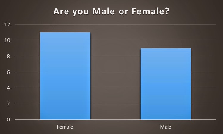
I produced a questionnaire on survey monkey that includes 10 questions. Once I made a questionnaire, I handed out my questionnaire to the peers in my class. From handing out the questionnaire, I obtained  results to the likes and dislikes of students in order to make my preliminary magazine front cover. The questions that I asked are below in the print screens I took.


Survey Monkey results


Results obtained fron the questionnaire I produced from survey monkey.


1)

2)

3)

4)

5)

6)

7)

8)

9)

10)